The first sight we will meet is this button. The button widget creates a button and applies to single elements. For example:
<html>
    <head>
        <metacharset='utf-8'>
        <link rel="stylesheet" href="https://cdnjs.cloudflare.com/ajax/libs/jqueryui/1.13.2/themes/base/jquery-ui.min.css"   />
        <link rel="stylesheet" href="https://cdnjs.cloudflare.com/ajax/libs/jqueryui/1.13.2/themes/base/theme.min.css"  />

        <script src="https://code.jquery.com/jquery-3.6.1.min.js"></script>
        <script src="https://cdnjs.cloudflare.com/ajax/libs/jqueryui/1.13.2/jquery-ui.min.js"  ></script>
    </head>
    <body>
        <h4>Link block</h4>
        <p><a class="a_jqui" href="https://google.com">Link 1</a></p>
        <p><a href="https://google.com">Link 2</a></p>

        <h4>Button block</h4>
        <p><button class="button_jqui">Button 1</button></p>
        <p><button>Button 2</button></p>
         <script type="text/javascript">
         $(function(){

            $('.a_jqui').button().click(function(e){
                e.preventDefault();
                alert('button widget');
            });
            $('.button_jqui').button();
         });
         </script>
    </body>
</html>
As a result, after the widget action, the button first link will receive the following markup:
<a aria-disabled="false" role="button" class="a_jqui ui-button ui-widget ui-state-default ui-corner-all ui-button-text-only" href="https://google.com"><span class="ui-button-text">Link 1</span></a>
As a result, visually it will look like this:

Depending on the chosen jquery-ui power plugin theme, the buttons you create may look slightly different, but we can also customize the style ourselves. For example, in the image above, you can see that the buttons are too big, and we can make them smaller by setting properties on the class UI-button:
<style>
    .ui-button {font-size: 13px;}
</style>
button widget methods
We can control the button widget through a number of methods:
button(“disable”): makes the button unavailable
$(function(){

    $('.a_jqui').button().click(function(e){
        e.preventDefault();
        $('.button_jqui').button('disable');
    });
    $('.button_jqui').button();
});
Please note that if the button widget has not been previously applied to elements, then its methods cannot be used.
- button(“enable”): makes the button available for interaction
- button(“destroy”): removes the button widget functionality from the element
- button(“widget”): returns a jQuery object representing the widget ( var widget = $(“.button_jqui”).button(“widget”);)
- button(“refresh”): Refreshes the visual state of an element
- button(“option”): allows you to get or set button property values:
<p><button class="get_option">Get value</button></p>
<p><button class="set_option">Set value</button></p>

<script type="text/javascript">
$(function(){

    $('button.get_option').button().click(function(){
        // get value
        var isDisabled=$('button.get_option').button('option', 'disabled');
        console.log(isDisabled);
    });
    $('button.set_option').button().click(function(){
        // set value
        $('button.set_option').button('option', 'disabled', true);
    });
});
</script>
To get a value, the name of the property to get is passed after “option” as the second parameter. And for setting, a third parameter is added, which points to the new value of the property passed in the second parameter.
button widget properties
In addition to methods, the button widget also has several properties defined.
property disabled. Above, we have already used this property to disable the button. But in addition, we can use the following syntax to set it:$(‘button.get_option’).button({disabled:true})
Property label: This property sets the label of the button. ( $(‘button.get_option’).button({label:’Button 1′})). If the initial label is set in the html markup of the button, then setting the label property replaces it.
The property icons sets the icon on the button. You can find the entire list of possible icons on the offsite at https://api.jqueryui.com/theming/icons/. In the jquery-ui download, these icons are in the css/images folder.
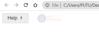
<button class="help">Help</button>
<script type="text/javascript">
$(function(){
    $('button.help').button({icons: { secondary: "ui-icon-help" }});
});
</script>
In this case, the icon is set after the button text:
If we need to set the icon before the text, then the option is used primary: $(‘button.help’).button({icons: { primary: “ui-icon-help” }});. Also, if desired, you can set icons before and after the text, using two options at once.
The property showLabelspecifies whether the label should be displayed on the button. $(‘button.get_option’).button({showLabel:false})- in this case, if the property is set for the button icons, i.e. icons are set, then the inscription will not be displayed, but the specified icon will be displayed. If the icons property is not specified, then the showLabel property is ignored.
Button group and button set
If the widget button allows you to create a button from one element, then it button set is used to create a group of buttons. For example, we can create a group of checkboxes (checkbox) or radio buttons (radio button). This button set applies not to the buttons themselves, but to their containers:
<div id="langs">
    <input type="radio" id="java" name="lang" checked><label for="java">Java</label>
    <input type="radio" id="csharp" name="lang"><label for="csharp">C#</label>
    <input type="radio" id="php" name="lang"><label for="php">PHP</label></p>
</div>
<script type="text/javascript">
$(function(){

    $('#langs').buttonset();
});
</script>

Similarly, we can set the widget for the checkbox group.