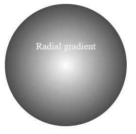
Radial gradients, unlike linear ones, propagate from the center outward in a circular pattern. To create a radial gradient, it is enough to specify the color that will be in the center of the gradient, and the color that should be on the outside. These colors are passed to the radial-gradient() function . For example:
<!DOCTYPE html>
<html lang="en">

<head>
    <meta charset="UTF-8">
    <meta http-equiv="X-UA-Compatible" content="IE=edge">
    <meta name="viewport" content="width=device-width, initial-scale=1.0">
    <title>radial gradient in CSS3</title>
</head>

<body>
    <div>
        <p>Radial gradient</p>
    </div>
</body>

</html>
As with the linear gradient, vendor prefixes must also be used here for browser support.
A radial gradient can have two shapes: circular and elliptical. The elliptical shape represents the spread of the gradient in the form of an ellipse and is specified using the keyword ellipse:
background-image: radial-gradient(ellipse, white, black);
Since this is the default value for the gradient, it may be omitted when used.
The circular shape represents the spread of the gradient in circles from the center outwards. The keyword is used for this circle:
background-image: radial-gradient(circle, white, black);
Typically, the center of the radial gradient is located at the center of the element, but this behavior can be overridden by specifying a value for the parameter background-position:
background-image: radial-gradient(25% 30%, circle, white, black);
The numbers 25% 30%mean that the center of the gradient will be at a distance of 25% from the left border and 30% from the top border of the element.
With the help of special additional values, you can set the size of the gradient:
- closest-side: The gradient only extends from the center to the side closest to the center of the element. That is, the gradient stays inside the element
- closest-corner: The width of the gradient is calculated from the distance from its center to the nearest corner of the element, so the gradient may extend beyond the element.
- farthest-side: gradient extends from the center to the farthest side of the element
- farthest-corner: the width of the gradient is calculated from the distance from its center to the farthest corner of the element
background-image: radial-gradient(25% 30%, circle farthest-corner, white, black);