Flex items in a flex container can have a specific direction, namely they can be laid out in rows or in columns. To control the direction of elements, CSS3 provides the flex-direction property. It defines the direction of the elements and can take the following values:
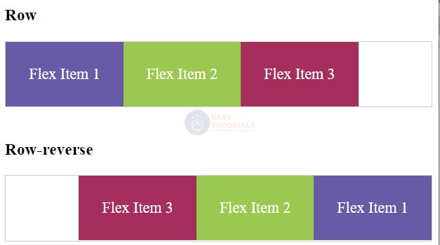
- row : default value where items are laid out in a row from left to right
- row-reverse : elements are also stacked only in reverse order from right to left
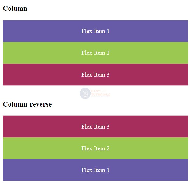
- column : elements are arranged in a column from top to bottom
- column-reverse : Elements are stacked in reverse order from bottom to top
For example, the location as a string:
<!DOCTYPE html>
<html lang="en">

<head>
    <meta charset="UTF-8">
    <meta http-equiv="X-UA-Compatible" content="IE=edge">
    <meta name="viewport" content="width=device-width, initial-scale=1.0">
    <title>Flexbox In CSS3</title>
    <style>
        .flex-container {
            display: flex;
            border: 1px solid #ccc;
        }

        .row {
            flex-direction: row;
        }

        .row-reverse {
            flex-direction: row-reverse;
        }

        .flex-item {
            text-align: center;
            font-size: 1.1em;
            padding: 1.5em;
            color: white;
        }

        .color1 {
            background-color: #675BA7;
        }

        .color2 {
            background-color: #9BC850;
        }

        .color3 {
            background-color: #A62E5C;
        }
    </style>
</head>

<body>
    <h3>Row</h3>
    <div class="flex-container row">
        <div class="flex-item color1">Flex Item 1</div>
        <div class="flex-item color2">Flex Item 2</div>
        <div class="flex-item color3">Flex Item 3</div>
    </div>

    <h3>Row-reverse</h3>
    <div class="flex-container row-reverse">
        <div class="flex-item color1">Flex Item 1</div>
        <div class="flex-item color2">Flex Item 2</div>
        <div class="flex-item color3">Flex Item 3</div>
    </div>
</body>

</html>
Column arrangement works similarly:
<!DOCTYPE html>
<html lang="en">

<head>
    <meta charset="UTF-8">
    <meta http-equiv="X-UA-Compatible" content="IE=edge">
    <meta name="viewport" content="width=device-width, initial-scale=1.0">
    <title>Flexbox In CSS3</title>
    <style>
        .flex-container {
            display: flex;
            border: 1px solid #ccc;
        }

        .column {
            flex-direction: column;
        }

        .column-reverse {
            flex-direction: column-reverse;
        }

        .flex-item {
            text-align: center;
            font-size: 1em;
            padding: 1.2em;
            color: white;
        }

        .color1 {
            background-color: #675BA7;
        }

        .color2 {
            background-color: #9BC850;
        }

        .color3 {
            background-color: #A62E5C;
        }
    </style>
</head>

<body>
    <h3>Column</h3>
    <div class="flex-container column">
        <div class="flex-item color1">Flex Item 1</div>
        <div class="flex-item color2">Flex Item 2</div>
        <div class="flex-item color3">Flex Item 3</div>
    </div>

    <h3>Column-reverse</h3>
    <div class="flex-container column-reverse">
        <div class="flex-item color1">Flex Item 1</div>
        <div class="flex-item color2">Flex Item 2</div>
        <div class="flex-item color3">Flex Item 3</div>
    </div>
</body>

</html>