CSS provides a number of properties that help style a table:
- border-collapse : sets how the border of adjacent cells will be styled
- border-spacing : sets the spacing between the borders of adjacent cells
- caption-side : sets the position of the caption element
- empty-cells : sets the rendering mode for empty cells
- table-layout : defines the dimensions of the table
Table setting
Previously, the attribute was widely used to set the border in the table border, for example:
<table border="2px" >
Now the trend is to use only CSS styles for styling, so the border is also set via CSS using the standard border property :
table {
    border: 1px solid #ccc;  /* whole table border */
}
tr {
    border: 1px solid #ccc;  /* borders between lines    */
}
td, th {
    border: 1px solid #ccc;  /* borders between columns */
}
When setting borders between columns using the border-collapse property, you can set a common or separate border between adjacent cells:
- collapse: adjacent cells have a common border
- separate: adjacent cells have separate borders that are separated by space
If adjacent cells have separate borders, then using the border-spacing property , you can set the space between the borders:
<!DOCTYPE html>
<html lang="en">

<head>
    <meta charset="UTF-8">
    <meta http-equiv="X-UA-Compatible" content="IE=edge">
    <meta name="viewport" content="width=device-width, initial-scale=1.0">
    <title>Styling tables in CSS3 </title>
    <style>
        table {
            border: 1px solid #ccc;
            border-spacing: 3px;
        }

        td,
        th {
            border: solid 1px #ccc;
        }

        .collapsed {
            border-collapse: collapse;
        }

        .separated {
            border-collapse: separate;
        }
    </style>
</head>

<body>
    <h3>Collapse</h3>
    <table class="collapsed">
        <tr>
            <th>Model</th>
            <th>Manufacturer</th>
            <th>Price</th>
        </tr>
        <tr>
            <td>Lumia 950</td>
            <td>Microsoft</td>
            <td>29900</td>
        </tr>
        <tr>
            <td>iPhone 6S</td>
            <td>Apple</td>
            <td>52900</td>
        </tr>
        <tr>
            <td>Nexus 6P</td>
            <td>Huawei</td>
            <td>49000</td>
        </tr>
    </table>
    <h3>Separate</h3>
    <table class="separated">
        <tr>
            <th>Model</th>
            <th>Manufacturer</th>
            <th>Price</th>
        </tr>
        <tr>
            <td>G 5</td>
            <td>LG</td>
            <td>44900</td>
        </tr>
        <tr>
            <td>HTC 10</td>
            <td>HTC</td>
            <td>49900</td>
        </tr>
        <tr>
            <td>Nexus 5X</td>
            <td>Google/LG</td>
            <td>25000</td>
        </tr>
    </table>
</body>

</html>

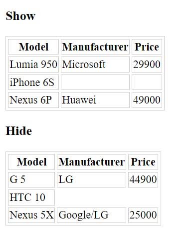
Empty cells
The empty-cells property allows you to style empty cells with one of the following values:
- show: Empty cells are displayed, default value
- hide: empty cells are not shown
<!DOCTYPE html>
<html lang="en">

<head>
    <meta charset="UTF-8">
    <meta http-equiv="X-UA-Compatible" content="IE=edge">
    <meta name="viewport" content="width=device-width, initial-scale=1.0">
    <title>Styling tables in CSS3 </title>
    <style>
        table {
            border: 1px solid #ccc;
            border-spacing: 3px;
        }

        td,
        th {
            border: solid 1px #ccc;
        }

        .hidden-empty-cells {
            empty-cells: hide;
        }
    </style>
</head>

<body>
    <h3>Show</h3>
    <table>
        <tr>
            <th>Model</th>
            <th>Manufacturer</th>
            <th>Price</th>
        </tr>
        <tr>
            <td>Lumia 950</td>
            <td>Microsoft</td>
            <td>29900</td>
        </tr>
        <tr>
            <td>iPhone 6S</td>
            <td></td>
            <td></td>
        </tr>
        <tr>
            <td>Nexus 6P</td>
            <td>Huawei</td>
            <td>49000</td>
        </tr>
    </table>
    <h3>Hide</h3>
    <table class="hidden-empty-cells">
        <tr>
            <th>Model</th>
            <th>Manufacturer</th>
            <th>Price</th>
        </tr>
        <tr>
            <td>G 5</td>
            <td>LG</td>
            <td>44900</td>
        </tr>
        <tr>
            <td>HTC 10</td>
            <td></td>
            <td></td>
        </tr>
        <tr>
            <td>Nexus 5X</td>
            <td>Google/LG</td>
            <td>25000</td>
        </tr>
    </table>
</body>

</html>
Header Positioning
The caption-side property controls the position of the caption and can take the following values:
- top: heading top position (default)
- bottom: heading position at the bottom
<!DOCTYPE html>
<html lang="en">

<head>
    <meta charset="UTF-8">
    <meta http-equiv="X-UA-Compatible" content="IE=edge">
    <meta name="viewport" content="width=device-width, initial-scale=1.0">
    <title>Styling tables in CSS3 </title>
    <style>
        table {
            border: 1px solid #ccc;
            border-spacing: 3px;
        }

        caption {

            font-weight: bold;
        }

        td,
        th {
            border: solid 1px #ccc;
        }

        .captionBottom {
            caption-side: bottom;
        }
    </style>
</head>

<body>
    <h3>Top</h3>
    <table>
        <caption>Flags of 2022</caption>
        <tr>
            <th>Model</th>
            <th>Manufacturer</th>
            <th>Price</th>
        </tr>
        <tr>
            <td>Lumia 950</td>
            <td>Microsoft</td>
            <td>29900</td>
        </tr>
        <tr>
            <td>iPhone 6S</td>
            <td>Apple</td>
            <td>52900</td>
        </tr>
        <tr>
            <td>Nexus 6P</td>
            <td>Huawei</td>
            <td>49000</td>
        </tr>
    </table>
    <h3>Bottom</h3>
    <table class="captionBottom">
        <caption>New in 2023</caption>
        <tr>
            <th>Model</th>
            <th>Manufacturer</th>
            <th>Price</th>
        </tr>
        <tr>
            <td>G 5</td>
            <td>LG</td>
            <td>44900</td>
        </tr>
        <tr>
            <td>HTC 10</td>
            <td>HTC</td>
            <td>49900</td>
        </tr>
        <tr>
            <td>iPhone SE</td>
            <td>Apple</td>
            <td>37000</td>
        </tr>
    </table>
</body>

</html>
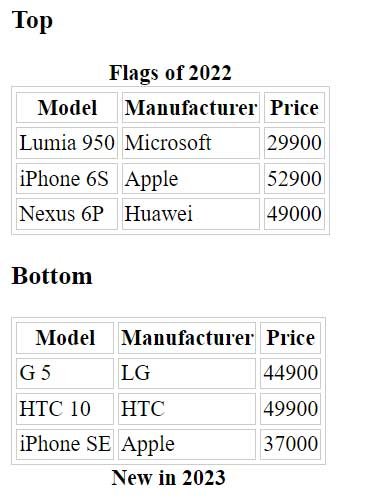
Table size control
The table-layout property controls the size of the table. By default, this property is set to auto, which causes the browser to automatically set the width of the table columns based on the width of the widest cell in the column. And the width of the individual columns adds up to the width of the entire table.
However, with another value – fixed you can set a fixed width:
table {
    border: 1px solid #ccc;
    border-spacing: 3px;
    table-layout: fixed;
    width:350px;
}
Cell vertical alignment
As a rule, the contents of table cells are aligned to the center of the cell. But with the vertical-align property, this behavior can be overridden. This property takes the following values:
- top: align content to the top of the cell
- baseline: align the first line of text to the top of the cell
- middle: center alignment (default)
- bottom: bottom alignment
The vertical-align property only applies to and elements:
td, th{
    border: solid 1px #ccc;
    vertical-align: bottom;
    height: 30px;
}