The dimensions of the elements are set using the properties width (width) and height (height).
The default value for these properties is auto, which means that the browser determines the width and height of the element. You can also explicitly set dimensions using units (pixels, ems) or percentages:
width: 150px
width: 75%
height: 15em;
Pixels define the exact width and height. The em unit depends on the height of the font in the element. If an element’s font size is, for example, 16 pixels, then 1 em for that element would be 16 pixels. That is, if the width of the element is set to 15em, then in fact it will be 15 * 16 = 230 pixels. If the element does not have a font size defined, then it will be taken from the inherited parameters or default values.
The percentage values for the width property are calculated based on the width of the container element. If, for example, the width of the body element on a web page is 1000 pixels, and the nested element is 75% wide, then the actual width of this block is 1000 * 0.75 = 750 pixels. If the user resizes the browser window, the width of the body element and, accordingly, the width of the nested div block will also change.
Percentage values for the height property work similarly to the width property, only now the height is calculated from the height of the container element.
For example:
<!DOCTYPE html>
<html lang="en">

<head>
    <meta charset="UTF-8">
    <meta http-equiv="X-UA-Compatible" content="IE=edge">
    <meta name="viewport" content="width=device-width, initial-scale=1.0">
    <title>Sizes in CSS3</title>
</head>


<body>
    <div class="outer">
        <div class="inner"></div>
    </div>
</body>

</html>

At the same time, the actual dimensions of the element may end up being different from those set in the width and properties height. For example:
<!DOCTYPE html>
<html lang="en">

<head>
    <meta charset="UTF-8">
    <meta http-equiv="X-UA-Compatible" content="IE=edge">
    <meta name="viewport" content="width=device-width, initial-scale=1.0">
    <title>Dimensions in CSS3</title>
</head>

<body>
    <div class="outer">
        Determining the actual size in CSS3
    </div>
</body>

</html>

As you can see in the screenshot, in reality, the value of the property width- 200px – determines only the width of the inner content of the element, and under the block of the element itself, space will be allocated, the width of which is equal to the width of the inner content (width property) + padding (padding property) + border width (property border-width) + margins (margin property). That is, the element will have a width of 230 pixels, and the width of the element block, taking into account the margins, will be 250 pixels.
Such calculations should be taken into account when determining the dimensions of the elements.
Using an additional set of properties, you can set the minimum and maximum sizes:
- min-width : minimum width
- max-width : maximum width
- min-height : minimum height
- max-height : maximum height
min-width: 200px;
width:50%;
max-width: 300px;
In this case, the width of the element is equal to 50% of the width of the container element, but it cannot be less than 200 pixels and more than 300 pixels.
Redefining block width
The box-sizing property allows you to override the set sizes of elements. It can take one of the following values:
content-box: the default value of the property, in which the browser adds the values of the properties width and the element, respectively, to determine the actual width and height of the height elements
For example:
width: 200px;
height: 100px;
margin: 10px;
padding: 10px;
border: 5px solid #ccc;
background-color: #eee;
box-sizing: content-box;
In this case, the element will have a width of 200 pixels and a height of 100 pixels.
padding-box: tells the web browser that the element’s width and height should include padding as part of its value. For example, let’s say we have the following style:
width: 200px;
height: 100px;
margin: 10px;
padding: 10px;
border: 5px solid #ccc;
background-color: #eee;
box-sizing: padding-box;
Here the actual width of the inner content of the block will be 200px (width) – 10px (padding-left) – 10px (padding-right) = 180px.It is worth noting that most modern browsers do not support this property.
border-box: tells the web browser that the element’s width and height should include padding and borders as part of its value. For example, let’s say we have the following style:
width: 200px;
height: 100px;
margin: 10px;
padding: 10px;
border: 5px solid #ccc;
background-color: #eee;
box-sizing: border-box;
Here the actual width of the inner content of the block will be 200px (width) – 10px (padding-left) – 10px (padding-right) – 5px (border-left-width) – 5px (border-right-width) = 170px.
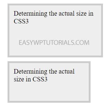
For example, let’s define two boxes that differ only in the value of the box-sizing property:
<!DOCTYPE html>
<html lang="en">

<head>
    <meta charset="UTF-8">
    <meta http-equiv="X-UA-Compatible" content="IE=edge">
    <meta name="viewport" content="width=device-width, initial-scale=1.0">
    <title>Dimensions in CSS3</title>
</head>

<body>
    <div class="outer1">
        Determining the actual size in CSS3
    </div>
    <div class="outer2">
        Determining the actual size in CSS3
    </div>
</body>

</html>
In the first case, when determining the size of the block, the width and height properties will be added to the border thickness, as well as padding and padding, so the first block will be large