The align-content property controls the alignment of rows (rows and columns) in a flex container and therefore applies if the property flex-wrap is set to wrap or wrap-reverse. The align-content property can have the following values:
- stretch : default value where rows (columns) are stretched to take up all available space
- flex-start : rows (columns) are aligned at the beginning of the container (for rows, this is the top edge, for columns, this is the left edge of the container)
- flex-end : rows (columns) are aligned to the end of the container (rows – bottom, columns – right)
- center : rows (columns) are positioned in the center of the container
- space-between : rows (columns) are evenly distributed across the container, and the same indents are formed between them. If there is not enough space in the container, then it acts similarly to the value flex-start
- space-around : rows (columns) distribute the space of the container equally, and the distance between the first and last row (column) and the container’s borders is half the distance between adjacent rows (columns).
Keep in mind that this property makes sense if the container has two or more rows (columns).
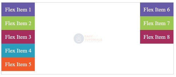
For example, the location of lines at the beginning of the container:
<!DOCTYPE html>
<html lang="en">

<head>
    <meta charset="UTF-8">
    <meta http-equiv="X-UA-Compatible" content="IE=edge">
    <meta name="viewport" content="width=device-width, initial-scale=1.0">
    <title>Flexbox In CSS3</title>
    <style>
        .flex-container {
            display: flex;
            border: 1px #ccc solid;
            flex-wrap: wrap;
            height: 200px;
            align-content: flex-start;
        }

        .flex-item {
            text-align: center;
            font-size: 16px;
            padding: 10px;
            color: white;
        }

        .item1 {
            background-color: #675BA7;
        }

        .item2 {
            background-color: #9BC850;
        }

        .item3 {
            background-color: #A62E5C;
        }

        .item4 {
            background-color: #2A9FBC;
        }

        .item5 {
            background-color: #F15B2A;
        }
    </style>
</head>

<body>
    <div class="flex-container">
        <div class="flex-item item1">Flex Item 1</div>
        <div class="flex-item item2">Flex Item 2</div>
        <div class="flex-item item3">Flex Item 3</div>
        <div class="flex-item item4">Flex Item 4</div>
        <div class="flex-item item5">Flex Item 5</div>
        <div class="flex-item item1">Flex Item 6</div>
        <div class="flex-item item2">Flex Item 7</div>
        <div class="flex-item item3">Flex Item 8</div>
    </div>

</html>
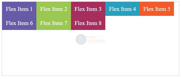
Let’s change the style of the container:
.flex-container {
    display: flex;
    border:1px #ccc solid;
    flex-wrap: wrap;
    height:200px;
    align-content: space-between;
    flex-direction: column;
}