text-transform
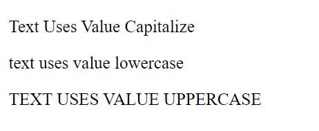
The text-transform property changes the case of text. It can take the following values:
- capitalize: capitalizes the first letter of a word
- uppercase: the whole word is converted to uppercase
- lowercase: the whole word is converted to lowercase
- none: word case is not changed in any way
For example:
<!DOCTYPE html>
<html lang="en">

<head>
    <meta charset="UTF-8">
    <meta http-equiv="X-UA-Compatible" content="IE=edge">
    <meta name="viewport" content="width=device-width, initial-scale=1.0">
    <title>Text Formating in CSS3</title>
</head>

<body>
    <div>
        <p class="capitalize">Text uses value capitalize</p>
        <p class="lowercase">Text uses value lowercase</p>
        <p class="uppercase">Text uses value uppercase</p>
    </div>
</body>

</html>
text-decoration property
The text-decoration property allows you to add some additional effects to the text. This property can take the following values:
- underline: underlines text
- overline: underlines text, draws top line
- line-through: strikethrough text
- none: no decoration applied to text
For example:
<!DOCTYPE html>
<html lang="en">

<head>
    <meta charset="UTF-8">
    <meta http-equiv="X-UA-Compatible" content="IE=edge">
    <meta name="viewport" content="width=device-width, initial-scale=1.0">
    <title>text decoration in CSS3</title>
</head>


<body>
    <div>
        <p class="under">This is underlined text .</p>
        <p class="over">This is Overline text.</p>
        <p class="line">This is strikethrough text. </p>
        <p class="mixed">This is underlined and strikethrough text</p>
        <p>not underlined <a href="index.php" class="none">link<a></p>
    </div>
</body>

</html>

We can combine values if necessary. So, in the penultimate case, the style was applied:
p.mixed { text-decoration: underline line-through; }
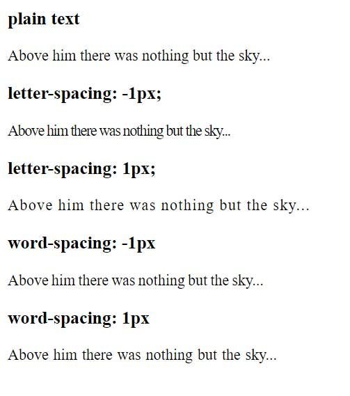
Intercharacter spacing
Two CSS properties let you control the spacing between characters and words of text. Letter-spacing is used for character spacing , and word-spacing is used for word spacing :
<!DOCTYPE html>
<html lang="en">

<head>
    <meta charset="UTF-8">
    <meta http-equiv="X-UA-Compatible" content="IE=edge">
    <meta name="viewport" content="width=device-width, initial-scale=1.0">
    <title>Fonts in CSS3</title>
</head>
<body>
    <div>
        <h3>plain text</h3>
        <p>Above him there was nothing but the sky...</p>
        <h3>letter-spacing: -1px;</h3>
        <p class="smallLetterSpace">Above him there was nothing but the sky...</p>
        <h3>letter-spacing: 1px;</h3>
        <p class="bigLetterSpace">Above him there was nothing but the sky...</p>
        <h3>word-spacing: -1px</h3>
        <p class="smallWordSpace">Above him there was nothing but the sky...</p>
        <h3>word-spacing: 1px</h3>
        <p class="bigWordSpace">Above him there was nothing but the sky...</p>
    </div>
</body>

</html>
text-shadow
The text-shadow property can be used to create shadows for text. Four values must be set for this property: the horizontal offset of the shadow relative to the text, the vertical offset of the shadow relative to the text, the amount of shadow blur, and the color of the shadow that is cast. For example:
h1{
    text-shadow: 5px 4px 3px #999;
}

In this case, the horizontal offset of the shadow relative to the letters is 5 pixels, and the vertical downward offset is 4 pixels. The amount of blur is 3 pixels and the color #999 is used for the shadow.
If we wanted to create a horizontal offset to the left instead of to the right as the default, then a negative value would have to be used. Similarly, a negative value must also be used to create a vertical offset upwards. For example:
h1{
    text-shadow: -5px -4px 3px #999;
}