With block layouts, we can run into a column-height problem, which can be especially pronounced if floating blocks have a certain background. Consider the problem with an example:
<!DOCTYPE html>
<html lang="en">

<head>
    <meta charset="UTF-8">
    <meta http-equiv="X-UA-Compatible" content="IE=edge">
    <meta name="viewport" content="width=device-width, initial-scale=1.0">
    <title>Column height alignment HTML5</title>
    <style>
        body,
        h2,
        p {
            margin: 0;
            padding: 0;
        }

        body {
            font-size: 18px;
        }

        #header {
            background-color: #eee;
            border-bottom: 1px solid #ccc;
            height: 80px;
        }

        #menu {
            background-color: #ddd;
            float: left;
            width: 150px;
        }

        #main {
            background-color: #f7f7f7;
            border-left: 1px solid #ccc;
            margin-left: 150px;
            padding: 10px;
        }

        #footer {
            border-top: 1px solid #ccc;
            background-color: #dedede;
        }
    </style>
</head>

<body>
    <div id="header">
        <h2> easywptutorials.com</h2>
    </div>
    <div id="menu">
        <ul>
            <li><a href="#">Home</a></li>
            <li><a href="#">About</a></li>
            <li><a href="#">Blog</a></li>
            <li><a href="#">Contact</a></li>
        </ul>
    </div>
    <div id="main">
        <h2>What is Lorem Ipsum?</h2>
        <p>Lorem Ipsum is simply dummy text of the printing and typesetting industry. Lorem Ipsum
            has been the industry...</p>
        <p>Lorem Ipsum is simply dummy text of the printing and typesetting industry. Lorem Ipsum
            has been the industry...</p>
        <p>Lorem Ipsum is simply dummy text of the printing and typesetting industry. Lorem Ipsum
            has been the industry...</p>
        <p>Lorem Ipsum is simply dummy text of the printing and typesetting industry. Lorem Ipsum
            has been the industry...</p>
    </div>
    <div id="footer">
        <p> Copyright © easywptutorials.com, 2022</p>
    </div>
</body>

</html>
The wrapping is already set here, and it works great, only depending on the amount of content, one column can be larger than the other:
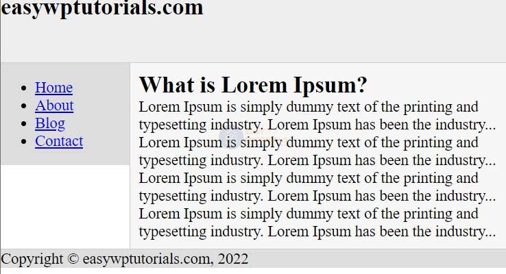
In this case, if there is a lot of text in the main block, then the menu block is not long enough.
The most common solution to this problem is to wrap the floating element and the box that wraps around it in a separate element that has a background. This background is then used by the smallest block in length. The result is the illusion that the blocks are of equal length, and the background of the blocks is set correctly.
So, let’s change the above created page as follows:
<!DOCTYPE html>
<html lang="en">

<head>
    <meta charset="UTF-8">
    <meta http-equiv="X-UA-Compatible" content="IE=edge">
    <meta name="viewport" content="width=device-width, initial-scale=1.0">
    <title>Column height alignment HTML5</title>
    <style>
        body,
        h2,
        p {
            margin: 0;
            padding: 0;
        }

        body {
            font-size: 18px;
        }

        #header {
            background-color: #eee;
            border-bottom: 1px solid #ccc;
            height: 80px;
        }

        #wrapper {
            background-color: #ddd;
        }

        #menu {
            float: left;
            width: 150px;
        }

        #main {
            background-color: #f7f7f7;
            border-left: 1px solid #ccc;
            margin-left: 150px;
            padding: 10px;
        }

        #footer {
            border-top: 1px solid #ccc;
            background-color: #dedede;
        }
    </style>
</head>

<body>
    <div id="header">
        <h2>easywptutorials.com</h2>
    </div>
    <div id="wrapper">
        <div id="menu">
            <ul>
                <li><a href="#">Home</a></li>
                <li><a href="#">About</a></li>
                <li><a href="#">Blog</a></li>
                <li><a href="#">Contact</a></li>
            </ul>
        </div>
        <div id="main">
            <h2>What is Lorem Ipsum?</h2>
            <p>Lorem Ipsum is simply dummy text of the printing and typesetting industry. Lorem Ipsum
                has been the industry...</p>
            <p>Lorem Ipsum is simply dummy text of the printing and typesetting industry. Lorem Ipsum
                has been the industry...</p>
            <p>Lorem Ipsum is simply dummy text of the printing and typesetting industry. Lorem Ipsum
                has been the industry...</p>
            <p>Lorem Ipsum is simply dummy text of the printing and typesetting industry. Lorem Ipsum
                has been the industry...</p>
        </div>
        <div id="footer">
            <p> Copyright © easywptutorials.com, 2022</p>
        </div>
</body>

</html>

In this case, the floating menu block and the main block that wraps around it are wrapped in a single wrapper element that sets the background for the menu element. And the main element, as the largest element, can use its own background setting.