The background of an element is described in CSS by the background property . In fact, this property is a shorthand for the set of the following CSS properties:
background-color : sets the background color
background-color: #ff0507;
background-image : sets the background to an image
background-image: url(back.jpg);
This property takes one value: the url keyword followed by the path to the image file in parentheses. In this case, it means that in the same folder next to the web page there is a back.jpg.
You can also use absolute URLs, for example:
background-image: url(http://example.com/images/someimage.png);
Or you can use relative addresses – relative to the html document or the site’s root directory:
background-image: url(../images/someimage.png); /* path relative to html document*/
- background-repeat : sets the background image to repeat over the entire surface of the element
- background-size : sets the size of the background image
- background-position : specifies the position of the background image
- background-attachment : sets the style of attaching a background image to an element
- background-clip : defines an area that is clipped from the image and used as the background
- background-origin : sets the starting position of the background image
For example:
<!DOCTYPE html>
<html lang="en">

<head>
    <meta charset="UTF-8">
    <meta http-equiv="X-UA-Compatible" content="IE=edge">
    <meta name="viewport" content="width=device-width, initial-scale=1.0">
    <title>Element Background in css3</title>
    <style>
        div {
            width: 250px;
            height: 200px;
            margin: 10px;
        }

        .colored {
            background-color: #ff0507;
        }

        .imaged {
            background-image: url(back.jpg);
        }
    </style>
</head>

<body>
    <div class="colored">First block</div>
    <div class="imaged">Second block</div>
</body>

</html>

- The first block is colored in a shade of red, and the second block sets the background to an image. All block content is superimposed on top of the background:
Image repetition
In the screenshot above, you can see that the CSS is properly scaling the image to best fit it into the element’s space. However, due to scaling, the image may not completely cover the surface of the element, and so the CSS automatically starts to repeat the image to fully cover it.
With the background-repeat property, you can change the repetition mechanism. It can take the following values:
- repeat-x: repeat horizontally
- repeat-y: repeat vertically
- repeat: repeat on both sides (default action)
- space: the image is repeated to fill the entire surface of the element, but without creating fragments
- round: the image is properly scaled to completely fill the entire space
- no-repeat: image is not repeated
For example:
div{
    width: 200px;
    height: 150px;

    background-image: url(back.jpg);
    background-repeat: round;
}
The background-size property allows you to set the size of the background image. To set the size, you can use either units of measurement, for example, pixels, or percentages, or one of the preset values:
- contain: scales the image to the longest side while maintaining the aspect ratio
- cover: Scales the image to the smallest side while maintaining the aspect ratio
- auto: default value, the image is displayed in full size
If you need to scale the image in such a way that it best fits into the background, then both settings can be set to 100%:
background-size: 100% 100%;
If exact dimensions are specified, then the width is specified first, and then the height of the image:
background-size: 200px 150px; /* width 200px, height 150px*/
You can set an exact value for one dimension – width or height, and set automatic dimensions for the other so that the browser itself displays the exact values:
background-size: 200px auto; /* 200px width, automatic height */
For example:
<!DOCTYPE html>
<html lang="en">

<head>
    <meta charset="UTF-8">
    <meta http-equiv="X-UA-Compatible" content="IE=edge">
    <meta name="viewport" content="width=device-width, initial-scale=1.0">
    <title>Element Background in css3</title>
    <style>
        div {
            width: 200px;
            height: 150px;
            margin: 10px;

            border: black solid 1px;
            background-image: url(back.jpg);

        }

        .imaged1 {

            background-size: cover;
        }

        .imaged2 {

            background-size: 140px 110px;
        }
    </style>
</head>

<body>
    <div class="imaged1"></div>
    <div class="imaged2"></div>
</body>

</html>
In the second case, the image will be scaled to 140×110. Since we still have room on the element, by default the image will repeat to fill the entire surface:

Image position
The background-position property controls the position of the background image within the element. It can accept padding from the top-left corner of an element in units of measure, such as pixels, in the following format:
background-position: offset_on_x_axis offset_on_y_axis;
For example:
 <!DOCTYPE html>
<html lang="en">

<head>
    <meta charset="UTF-8">
    <meta http-equiv="X-UA-Compatible" content="IE=edge">
    <meta name="viewport" content="width=device-width, initial-scale=1.0">
    <title>Image position in css3</title>
    <style>
        div {
            width: 300px;
            height: 250px;
            margin: 10px;

            border: 1px solid #ccc;
            background-color: #eee;
            background-image: url(back.jpg);
            background-repeat: no-repeat;
            background-position: 20px 15px;
        }
    </style>
</head>

<body>
    <div>Lorem ipsum dolor sit amet, consectetur adipiscing elit. Pellentesque et erat vestibulum, ultricies nibh vel, feugiat augue. Duis quis malesuada elit. </div>
</body>

</html>

In addition, this property can take one of the following values:
- top: align to the top of the element
- left: left-align element
- right: right-align element
- bottom: align to the bottom of the element
- center: the image is centered on the element
For example:
background-position: top right;
Here the image is top-aligned and right-aligned, meaning it will be positioned in the top right corner of the element.
background-attachment
The background-attachment property controls how the background image will be attached to the element. This property can take the following values:
- fixed: the element’s background is fixed regardless of scrolling within the element
- local: as you scroll inside the element, the background changes
- scroll: the background is fixed and does not change on scroll, but unlike fixed, multiple elements can use their own background, while fixed creates one background for all elements
For example:
div{
width: 300px;
height: 250px;
overflow:scroll;
border: 1px solid #ccc;
background-image: url(dubi.png);
background-size: 512px 384px;
background-attachment: scroll;
background-repeat: no-repeat;
}
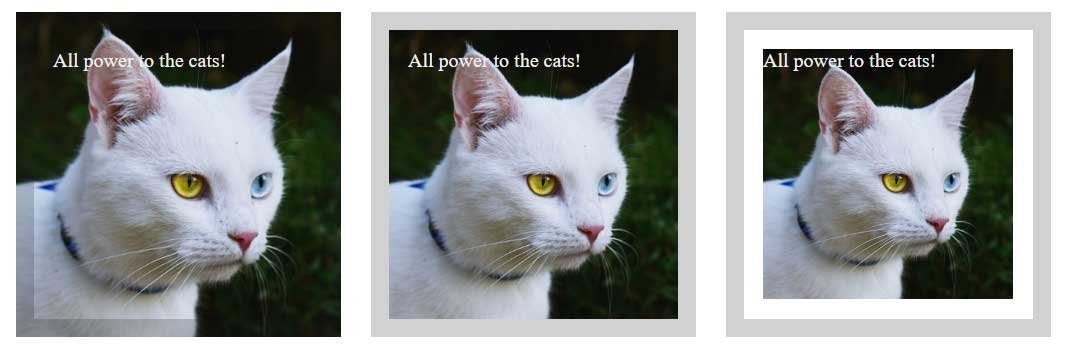
background-origin
The background-origin property specifies the position on the image where the actual background image for the element will start. It can take the following values:
- border-box: the element’s background is set starting from its outer border, defined by the border property
- padding-box: background is set with padding
- content-box: the background is set to the content of the element
We use all three values:
<!DOCTYPE html>
<html lang="en">

<head>
    <meta charset="UTF-8">
    <meta http-equiv="X-UA-Compatible" content="IE=edge">
    <meta name="viewport" content="width=device-width, initial-scale=1.0">
    <title>background-origin in css3</title>
    <style>
        div {
            width: 200px;
            height: 200px;
            margin: 10px;
            display: inline-block;
            color: #eee;

            padding: 15px;
            border: 15px solid rgba(23, 23, 23, 0.2);

            background-image: url(cats.jpg);
            background-size: cover;
            background-repeat: no-repeat;
        }

        .borderBox {
            background-origin: border-box;
        }

        .paddingBox {
            background-origin: padding-box;
        }

        .contentBox {
            background-origin: content-box;
        }
    </style>
</head>

<body>
    <div class="borderBox">
        All power to the cats!
    </div>
    <div class="paddingBox">
        All power to the cats!
    </div>
    <div class="contentBox">
        All power to the cats!
    </div>
</body>

</html>

background-clip
The background-clip property determines how much of the image is used for the background. It takes the same values:
- border-box: the image is clipped to the borders of the element
- padding-box: excludes from the image the part that is under the borders of the element
- content-box: the image is clipped to fit the content, including padding
For example, if we apply the following styles to the previous markup:
div{
width: 200px;
height: 200px;
margin: 10px;
display: inline-block;

color: #eee;
padding:15px;
border: 15px solid rgba(23,23,23,0.1);

background-image: url(cats.jpg);
background-size: cover;
background-repeat: no-repeat;
}
.borderBox{background-clip: border-box;}
.paddingBox{background-clip: padding-box;}
.contentBox{background-clip: content-box;}
Then we get the following result:

background property
The background property is essentially a shorthand for all previously discussed CSS properties in the format:
background: <background-color> <background-position> <background-size> <background-repeat> <background-origin> <background-clip> <background-attachment> <background-image>
For example, if we have the following set of properties:
background-image: url(cats.jpg);
background-color: #eee;
background-repeat: no-repeat;
background-clip: border-box;
background-origin: border-box;
background-attachment: local;
So we can shorten them as follows:
background: #eee no-repeat border-box local url(cats.jpg);