One of the innovations of CSS3 compared to the previous version is the built-in ability to transform an element. Transforms include actions such as rotating an element, scaling it, skewing it, or moving it vertically or horizontally. CSS3 uses the transform property to create transforms .
Rotation
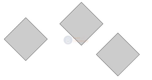
To rotate an element, the property uses the rotate transform function :
transform: rotate(angle_of_rotation deg);
After the word rotate in parentheses comes the value of the angle of rotation in degrees. For example, let’s rotate the block by 30 degrees:
<!DOCTYPE html>
<html lang="en">

<head>
    <meta charset="UTF-8">
    <meta http-equiv="X-UA-Compatible" content="IE=edge">
    <meta name="viewport" content="width=device-width, initial-scale=1.0">
    <title>Transformations in CSS3</title>
</head>

<body>
    <div></div>
    <div class="rotated">rotate(30deg)</div>
    <div></div>
</body>

</html>
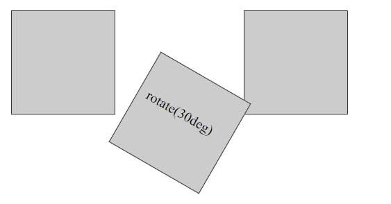
In this case, it can be noted that during rotation, the rotated element can overlap with neighboring elements, since the position of the elements is first set and only then the rotation.
The angle of rotation can be either positive or negative. In the case of a negative value, the rotation is performed in the opposite direction.
Scaling
The application of scaling has the following form:
transform: scale(scale_value);
Using scaling:
<!DOCTYPE html>
<html lang="en">

<head>
    <meta charset="UTF-8">
    <meta http-equiv="X-UA-Compatible" content="IE=edge">
    <meta name="viewport" content="width=device-width, initial-scale=1.0">
    <title>Transformations in CSS3</title>
</head>

<body>
    <div></div>
    <div class="doubleScale">scale(2)</div>
    <div></div>
    <div class="halfScale">scale(0.5)</div>
</body>

</html>
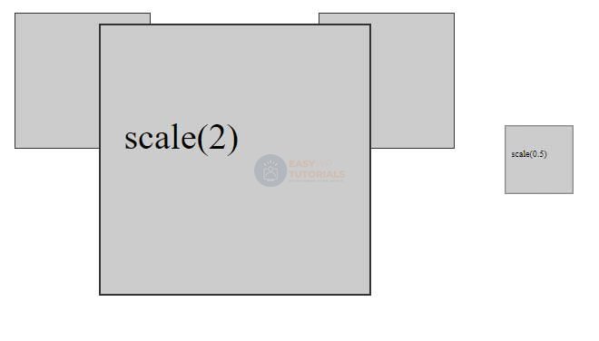
A value greater than 1 results in vertical and horizontal stretch, and a value less than 1 results in contraction. That is, a value of 0.5 leads to a decrease in two times, and a value of 1.5 – to an increase in one and a half times.
You can also set scaling values separately for vertical and horizontal:
<!DOCTYPE html>
<html lang="en">

<head>
    <meta charset="UTF-8">
    <meta http-equiv="X-UA-Compatible" content="IE=edge">
    <meta name="viewport" content="width=device-width, initial-scale=1.0">
    <title>Transformations in CSS3</title>
</head>

<body>
    <div></div>
    <div class="scale1">scale(2, 0.5)</div>
    <div></div>
</body>

</html>
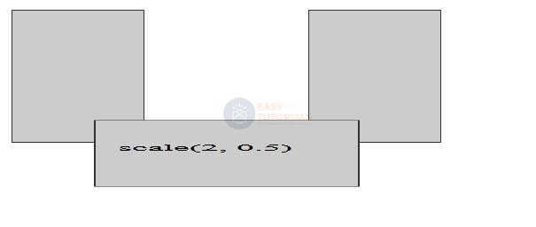
In this case, the horizontal scaling will be 2 times, and vertically – 0.5 times.
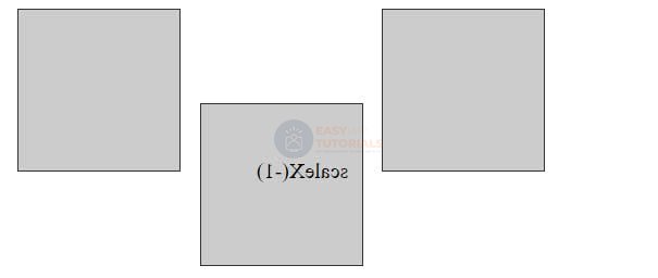
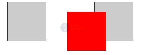
You can also set the scaling parameters individually: the scaleX() function sets the horizontal change, and scaleY() the vertical change. For example:
.scale1{
    transform: scaleX(2);
}
Using negative values, you can create a mirror effect:
<!DOCTYPE html>
<html lang="en">

<head>
    <meta charset="UTF-8">
    <meta http-equiv="X-UA-Compatible" content="IE=edge">
    <meta name="viewport" content="width=device-width, initial-scale=1.0">
    <title>Transformations in CSS3</title>
</head>

<body>
    <div></div>
    <div class="scale1">scaleX(-1)</div>
    <div></div>
</body>

</html>
moving
To move an element, use the translate function :
transform: translate(offset_X, offset_Y);
The value offset_X indicates how much the element is shifted horizontally, and offset_Y- vertically.
For example, let’s move the block 30 pixels down and 50 pixels to the right:
<!DOCTYPE html>
<html lang="en">

<head>
    <meta charset="UTF-8">
    <meta http-equiv="X-UA-Compatible" content="IE=edge">
    <meta name="viewport" content="width=device-width, initial-scale=1.0">
    <title>Transformations in CSS3</title>
</head>

<body>
    <div></div>
    <div class="translated"></div>
    <div></div>
</body>

</html>
Not only pixels can be used as displacement units, but also any other length units in CSS – em, %, etc.
With the help of additional functions, you can separately apply offsets to the horizontal or vertical: translateX() (horizontal translation) and translateY() (vertical translation). For example:
transform: translateX(30px);
In addition to positive values, you can also use negative ones – they move the element in the opposite direction:
transform: translateY(-2.5em);
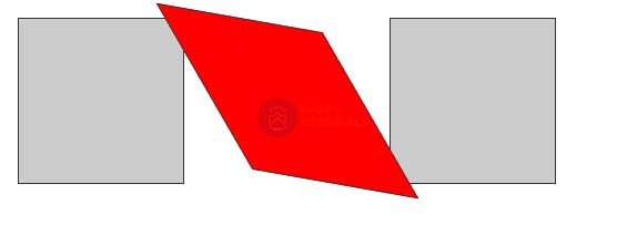
Slope
To skew an element, use the skew() function :
transform: skew(X, Y);
The first parameter specifies how many degrees to skew the element along the x-axis, and the second – the value of the slant along the y-axis.
<!DOCTYPE html>
<html lang="en">

<head>
    <meta charset="UTF-8">
    <meta http-equiv="X-UA-Compatible" content="IE=edge">
    <meta name="viewport" content="width=device-width, initial-scale=1.0">
    <title>Transformations in CSS3</title>
</head>

<body>
    <div></div>
    <div class="skewed"></div>
    <div></div>
</body>

</html>
To create skew on only one axis, use a value of 0 for the other axis. For example, skew 45 degrees on the x-axis:
transform: skew(45deg, 0);
Or a 45-degree tilt on the Y-axis only:
transform: skew(0,45deg);
To create a slope separately for the x-axis and y-axis, CSS has special functions: skewX() and skewY() respectively.
transform: skewX(45deg);
You can also pass negative values. Then the slope will be carried out in the opposite direction:
transform: skewX(-30deg);
Combining transformations
If we need to apply several transformations to an element at once, say, rotation and translation, then we can combine them. For example, applying all four transformations:
transform: translate(50px, 100px) skew(30deg, 10deg) scale(1.5) rotate(90deg);
The browser applies all these functions in the order in which they appear. That is, in this case, first the movement is applied to the element, then the slope, then the scaling, and finally the rotation.
Starting point of transformation
By default, when applying transformations, the browser uses the center of the element as the starting point for the transformation. But with the transform-origin property, you can change the origin. This property accepts pixels, ems, and percentages as its value. You can also use keywords to set a point:
- left top: top left corner of the element
- left bottom: bottom left corner of the element
- right top: top right corner of the element
- right bottom: bottom right corner of the element
<!DOCTYPE html>
<html lang="en">

<head>
    <meta charset="UTF-8">
    <meta http-equiv="X-UA-Compatible" content="IE=edge">
    <meta name="viewport" content="width=device-width, initial-scale=1.0">
    <title>Transformations in CSS3</title>
</head>

<body>
    <div class="transform1"></div>
    <div class="transform2"></div>
    <div class="transform3"></div>
</body>

</html>