When working with floating elements and the float property , it is quite common to encounter the problem of floating elements falling out of the page. This problem has various aspects and their solutions. Let’s consider these aspects.
For example, let’s say we have the following block:
<!DOCTYPE html>
<html lang="en">

<head>
    <meta charset="UTF-8">
    <meta http-equiv="X-UA-Compatible" content="IE=edge">
    <meta name="viewport" content="width=device-width, initial-scale=1.0">
    <title>Block layout in HTML5</title>
    <style>
        #sidebar {
            float: left;
            width: 25%;
            padding: 10px;
        }

        #main {
            border-left: 1px solid #ccc;
            width: 75%;
            padding: 15px;
            margin-left: 25%;
        }
    </style>
</head>

<body>
    <div id="sidebar">
        <h2>The standard Lorem Ipsum passage</h2>
        <p>"Lorem ipsum dolor sit amet, consectetur adipiscing elit, sed do
            eiusmod tempor incididunt ut labore et dolore...</p>
    </div>
    <div id="main">
        <h2>What is Lorem Ipsum?</h2>
        <p>Lorem Ipsum is simply dummy text of the printing and typesetting industry...</p>
        <p>Contrary to popular belief, Lorem Ipsum is not simply random text..</p>
    </div>
</body>

</html>
There is quite a lot of text in the sidebar which is expected to fit effectively within the bounds of the floating block. However, in reality, we can get a problem:
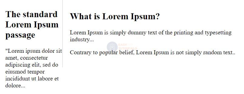
As you can see in the screenshot, the letters crawl out of the floating block beyond the border, despite the fact that, in theory, the floating block should also have an inner indent of 10 pixels from the right border.
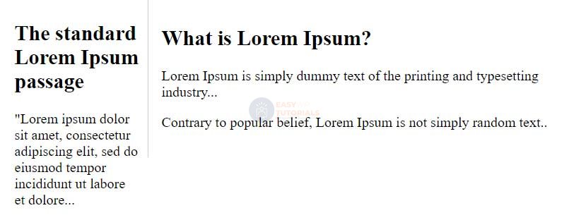
Why is this happening? Browsers often interpret element sizes differently. In particular, all elements default to content-box for the box-sizing property , which means that when determining the width and height of an element, the browser will add padding and border width to the property value as well . As a result, this can lead to the loss of floating elements from the blocks that are intended for them. Therefore, it is often recommended to set the box-sizing property to border-box for all elements, so that all elements are measured the same way, and their width represents only the value of the property . Therefore, the following style is often added to styles:widthheightwidth
* {
    box-sizing: border-box;
}
That is, the value box-sizing: border-box;is set for all elements, and they are all interpreted by the browser in the same way. For example, let’s add this style to the page defined above and we will get a slightly different result:
Consider another problem that is related to the positioning of floating elements in a container:
<!DOCTYPE html>
<html lang="en">

<head>
    <meta charset="UTF-8">
    <meta http-equiv="X-UA-Compatible" content="IE=edge">
    <meta name="viewport" content="width=device-width, initial-scale=1.0">
    <title>Block layout in HTML5</title>
    <style>
        * {
            box-sizing: border-box;
        }

        #header {
            background-color: #eee;
        }

        #nav {
            background-color: #f4f4f4;
            border-top: 1px solid #ccc;
            border-bottom: 1px solid #ccc;
        }

        #nav ul {
            margin-left: 0px;
            padding-left: 0px;
            list-style: none;
        }

        #nav li {
            float: left;
        }

        #nav ul a {
            display: block;
            width: 7em;
            padding: 10px;
            border-left: 1px solid #ccc;
            text-decoration: none;
            color: #333;
            text-align: center;
        }

        #nav ul li:last-child a {

            border-right: 1px solid #ccc;
        }

        #nav ul a:hover {
            background-color: #aaa;
            color: #f4f4f4;
        }
    </style>
</head>

<body>
    <div id="header">
        <h1>Welcome to the site</h1>
        <div id="nav">
            <ul>
                <li><a href="#">Home</a></li>
                <li><a href="#">Blog</a></li>
                <li><a href="#">Contacts</a></li>
                <li><a href="#">About</a></li>
            </ul>
        </div>
    </div>
    <div id="content">
        <p>helo world</p>
    </div>
</body>

</html>

Even though the navigation bar is defined in a block with the id header, visually it is clearly not in the head element. Well, besides, here you can also see that incomprehensible indents appear, and the next block after the header gets on the menu.
The issue with padding is that the browser defaults to inline styles for various elements. So it can be a bit confusing how and where these styles are defined, why they are applied. Often, to solve this problem, developers simply reset some of the most significant styles for most elements:
html, body, div, span, h1, h2, h3, h4, h5, h6, p, a, img, dl, dt, dd,
ol, ul, li, form, table, caption, tr, th, td, article, aside, footer, header{

    margin: 0;
    padding: 0;
    border: 0;
    font-size: 100%;
    vertical-align: baseline;
}
Another problem is to overlay a div element with the main content on a floating navbar block is solved quite simply by setting this div element to the following style:
clear: both;
More complex is the problem with floating menu items falling out of the container block boundaries. There are two possible solutions here. The first solution is to add the following style to the element that represents the navigation bar:
ul:after {
    content: " ";
    display: table;
    clear: both;
}
The second solution is to make the navigation bar block itself float:
#nav{
    background-color: #f4f4f4;
    border-top: 1px solid #ccc;
    border-bottom: 1px solid #ccc;

    float:left;
    width: 100%;
    clear: both;
}
So, taking into account the above, let’s change the styles for the web page (the html code remains the same):
* {
    box-sizing: border-box;
}
html, body, div, span, h1, h2, h3, h4, h5, h6, p, a, img, dl, dt, dd,
ol, ul, li, form, table, caption, tr, th, td, article, aside, footer, header{
    margin: 0;
    padding: 0;
    border: 0;
    font-size: 100%;
    vertical-align: baseline;
}
#header {
    background-color: #eee;
}

#header h1 {
    font-size: 1.3em;
    padding: 15px;
}

#nav {
    background-color: #f4f4f4;
    border-top: 1px solid #ccc;
    border-bottom: 1px solid #ccc;
}

#nav ul {
    margin-left: 0px;
    padding-left: 0px;
    list-style: none;
}

#nav li {
    float: left;
}

#nav ul a {
    display: block;
    width: 7em;
    padding: 10px;
    border-left: 1px solid #ccc;
    text-decoration: none;
    color: #333;
    text-align: center;
}

#nav ul li:last-child a {

    border-right: 1px solid #ccc;
}

#nav ul a:hover {
    background-color: #aaa;
    color: #f4f4f4;
}

#nav ul:after {
    content: " ";
    display: table;
    clear: both;
}

#content {
    clear: both;
}
And now the web page will look different, in fact, as it should:
