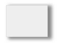
The box-shadow property allows you to create a shadow on an element. This property can take several values at once:
box-shadow: hoffset voffset blur spread color inset
- hoffset: The horizontal offset of the shadow relative to the element. A positive value shifts the shadow to the right, and a negative value shifts it to the left.
- voffset: The vertical offset of the shadow relative to the element. A positive value moves the shadow down, and a negative value moves it up.
- blur: An optional value that specifies the blur radius of the shadow. The larger this value, the more blurred the edges of the shadow will be. The default value is 0.
- spread: An optional value that specifies the direction of the shadow. A positive value extends the shadow outward in all directions from the element, while a negative value directs the shadow towards the element
- color: optional value that sets the color of the shadow
- inset: optional value that causes the tent to be drawn inside the element block
For example:
<!DOCTYPE html>
<html lang="en">

<head>
    <meta charset="UTF-8">
    <meta http-equiv="X-UA-Compatible" content="IE=edge">
    <meta name="viewport" content="width=device-width, initial-scale=1.0">
    <title>Shadow in css3</title>
</head>

<body>
    <div></div>
</body>

</html>
You can define several different shadows separated by commas:
box-shadow: 5px 3px 8px 3px #faa, 10px 4px 10px 3px #888 inset;