The navigation bar plays an important role on the site, as it provides transitions between pages of the site or to external resources. Let’s see how to create a simple navigation bar.
In effect, a navigation bar is a collection of links, often in an unordered list. Navigation bars come in a variety of styles: vertical and horizontal, single-level and multi-level, but in any case, the <a> element is at the center of each navigation . Therefore, when creating a navigation bar, we may encounter a number of difficulties that stem from the limitations of the link element. Namely, the element <a> is inline, which means that we cannot specify a width, height, or padding for it. The width of the link automatically takes the place that it needs.<a>
Vertical menu
A common solution to this problem for creating a vertical menu is to make the link a block element.
<!DOCTYPE html>
<html lang="en">

<head>
    <meta charset="UTF-8">
    <meta http-equiv="X-UA-Compatible" content="IE=edge">
    <meta name="viewport" content="width=device-width, initial-scale=1.0">
    <title>Creating Navigation bar in HTML5</title>
</head>

<body>
    <ul class="nav">
        <li><a href="#">Home</a></li>
        <li><a href="#">Contacts</a></li>
        <li><a href="#">About</a></li>
    </ul>
</body>

</html>
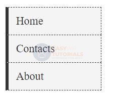
After setting the property, display: block we can define the link block’s width, padding, and so on.
Horizontal menu
There are two methods for creating a horizontal menu. The first is to apply the property float and create floating elements from the references that wrap around each other from the left. And the second way is to create a link string by setting the display: inline-block.
Using float
The algorithm for creating a navigation bar using float is divided into two steps. In the first step, the li element that contains the link is set to float: left;. This allows all the elements of the list to be arranged in a row with sufficient width when the right element of the list wraps around the left element of the list.
The second step is to install a link on the element display: block, which gives us the ability to set the width, padding, in general, all those features that are typical for block elements.
<!DOCTYPE html>
<html lang="en">

<head>
    <meta charset="UTF-8">
    <meta http-equiv="X-UA-Compatible" content="IE=edge">
    <meta name="viewport" content="width=device-width, initial-scale=1.0">
    <title>Creating Navigation bar in HTML5</title>
</head>

<body>
    <ul class="nav">
        <li><a href="#">Home</a></li>
        <li><a href="#">Blog</a></li>
        <li><a href="#">Contacts</a></li>
        <li><a href="#">About</a></li>
    </ul>
</body>

</html>
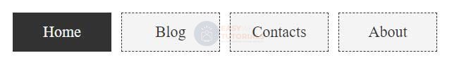
inline and inline-block
To create a horizontal navigation bar, we need to make each li element inline, that is, set it to display: inline. After that, for the element of the link that is located in the element li, we can set display: inline-block:
<!DOCTYPE html>
<html lang="en">

<head>
    <meta charset="UTF-8">
    <meta http-equiv="X-UA-Compatible" content="IE=edge">
    <meta name="viewport" content="width=device-width, initial-scale=1.0">
    <title>Creating Navigation bar in HTML5</title>
</head>

<body>
    <ul class="nav">
        <li><a href="#">Home</a></li>
        <li><a href="#">Blog</a></li>
        <li><a href="#">Contacts</a></li>
        <li><a href="#">About</a></li>
    </ul>
</body>

</html>
