As a rule, a web page consists of many different elements, which can have a complex structure. Therefore, when creating a web page, it becomes necessary to properly position these elements, style them so that they are located on the page in the right way. That is, the question arises of creating a page layout, its layout.
There are various ways, strategies and types of layout. Initially, layout based on tables was common. Since the table allows, if necessary, it is very easy and simple to divide the entire space of a web page into rows and columns. Rows and columns are fairly easy to manage, and it’s easy to position any content in them. This is what determined the popularity of tabular layout.
However, tabular layout creates pages that are not the most flexible in terms of design, which is especially relevant in a world where there is no single screen resolution, i.e. large screens on TVs, small screens on tablets and phablets, very small screens on smartphones, etc. . All this variety of screens tabular layout was not able to satisfy. Therefore, it was gradually replaced by block layout. Block layout is a relatively conventional name for layout methods and techniques when most web pages use the float CSS property for markup , and the main building element of web pages is the
Earlier in one of the previous topics, the action of the property was considered float. Now let’s use it to create a two-column web page. Suppose we have a standard header and footer at the top and bottom, and two columns in the center: a column with a menu or a sidebar and a column with the main content.
First, let’s define all the blocks. When working with elements that use wrapping and the property float, their order is important. For example, the code for the floating element whose property is being set floatmust come before the element that wraps around the floating element. That is, the sidebar block will go before the main content block:
<!DOCTYPE html>
<html lang="en">

<head>
    <meta charset="UTF-8">
    <meta http-equiv="X-UA-Compatible" content="IE=edge">
    <meta name="viewport" content="width=device-width, initial-scale=1.0">
    <title>Block Layout in HTML5</title>
    <style>
        div {
            margin: 10px;
            border: 1px solid black;
            font-size: 20px;
            height: 80px;
        }

        #header {
            background-color: #ccc;
        }

        #sidebar {
            background-color: #ddd;
        }

        #main {
            background-color: #eee;
            height: 200px;
        }

        #footer {
            background-color: #ccc;
        }
    </style>
</head>

<body>
    <div id="header">Header Area</div>
    <div id="sidebar">Sidebar</div>
    <div id="main">Content Area</div>
    <div id="footer">Footer</div>
</body>

</html>
That is, until the following page is obtained:
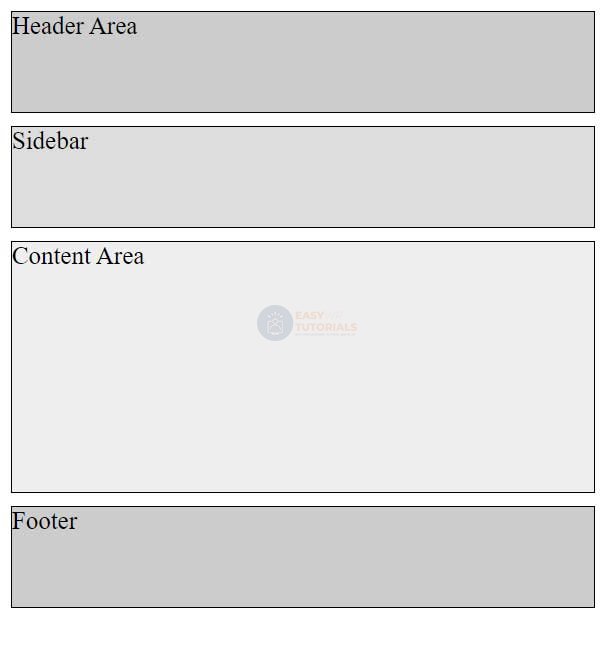
The height, border and padding of the blocks in this case are added only for beauty, to identify the space of the block and separate it from others.
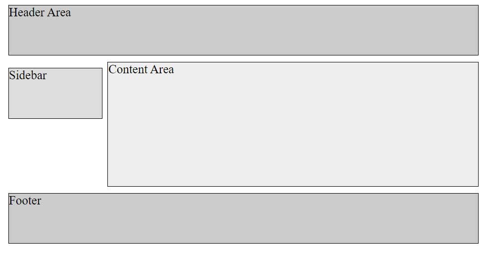
Next, in order to move the sidebar block to the left of the main content block and get the wrapping effect, we need to specify a sidebar block property float: leftand a preferred width. The width can be fixed, like 150px or 8em. Or you can also use percentages, for example, 30% – 30% of the width of the body container. On the one hand, fixed-width boxes are easier to manage, but on the other hand, width percentages allow you to create more flexible, fluid boxes that resize when the browser window is resized.
The last step is to set the indentation of the block with the main content from the sidebar block. Since the wrapping box can wrap around the floating element to the right and bottom when flowing, if the floating element has a lower height, then we need to set the padding to at least equal to the width of the floating element. For example, if the width of the sidebar is 150px, then the main content block can be padded to 170px, which will create white space between the two blocks.
At the same time, you should not explicitly specify a width for the main content block, as browsers automatically expand it so that it takes up all the available space.
So, taking into account all of the above, we will change the styles of the sidebar blocks and the main content as follows:
<!DOCTYPE html>
<html lang="en">

<head>
    <meta charset="UTF-8">
    <meta http-equiv="X-UA-Compatible" content="IE=edge">
    <meta name="viewport" content="width=device-width, initial-scale=1.0">
    <title>Block Layout in HTML5</title>
    <style>
        div {
            margin: 10px;
            border: 1px solid black;
            font-size: 20px;
            height: 80px;
        }

        #header {
            background-color: #ccc;
        }

        #sidebar {
            background-color: #ddd;
            float: left;
            width: 150px;
        }

        #main {
            background-color: #eee;
            height: 200px;
            margin-left: 170px;
            /* 150px (sidebar width) + 10px + 10px (2 padding) */
        }
        #footer {
            background-color: #ccc;
        }
    </style>
</head>

<body>
    <div id="header">Header Area</div>
    <div id="sidebar">Sidebar</div>
    <div id="main">Content Area</div>
    <div id="footer">Footer</div>
</body>

</html>
The height of the blocks in this case is indicated conditionally for greater clarity, in reality, as a rule, the height will be automatically set by the browser.
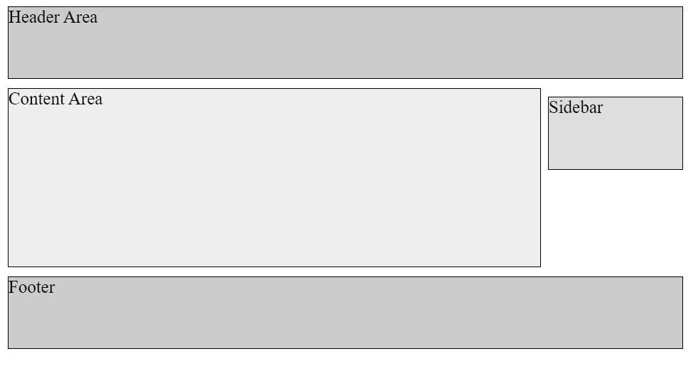
Creating the right sidebar will be similar, only now we need to set the sidebar to float: right, and the main content block to the right padding:
<!DOCTYPE html>
<html lang="en">

<head>
    <meta charset="UTF-8">
    <meta http-equiv="X-UA-Compatible" content="IE=edge">
    <meta name="viewport" content="width=device-width, initial-scale=1.0">
    <title>Block Layout in HTML5</title>
    <style>
        div {
            margin: 10px;
            border: 1px solid black;
            font-size: 20px;
            height: 80px;
        }

        #header {
            background-color: #ccc;
        }

        #sidebar {
            background-color: #ddd;
            float: right;
            width: 150px
        }

        #main {
            background-color: #eee;
            height: 200px;
            margin-right: 170px;
        }

        #footer {
            background-color: #ccc;
        }
    </style>
</head>

<body>
    <div id="header">Header Area</div>
    <div id="sidebar">Sidebar</div>
    <div id="main">Content Area</div>
    <div id="footer">Footer</div>
</body>

</html>
At the same time, the html markup remains the same, the sidebar block must still precede the main content block.