The flex-wrap property determines whether the flex container will have multiple rows of items (rows or columns) if its size is not large enough to fit all the items in one row. This property can take the following values:
- nowrap : a default value that defines a flex container where all items are laid out in one row (when laid out as rows) or one column (when laid out in a column)
- wrap : If the items don’t fit in the flex container, it creates extra rows in the container to accommodate the items. When arranged as a row, additional rows are created, and when arranged as a column, additional columns are added
- wrap-reverse : same as wrap, only elements are in reverse order
For example, take the default value nowrap:
<!DOCTYPE html>
<html lang="en">

<head>
    <meta charset="UTF-8">
    <meta http-equiv="X-UA-Compatible" content="IE=edge">
    <meta name="viewport" content="width=device-width, initial-scale=1.0">
    <title>Flexbox In CSS3</title>
    <style>
        .flex-container {
            display: flex;
            border: solid 0.25em #000;
            width: 60%;
            height: 8.25em;
            flex-wrap: nowrap;
        }

        .row {
            flex-direction: row;
        }

        .row-reverse {
            flex-direction: row-reverse;
        }

        .flex-item {
            text-align: center;
            font-size: 1em;
            padding: 1.5em;
            color: white;
            opacity: 0.8;
        }

        .color1 {
            background-color: #675BA7;
        }

        .color2 {
            background-color: #9BC850;
        }

        .color3 {
            background-color: #A62E5C;
        }

        .color4 {
            background-color: #2A9FBC;
        }

        .color5 {
            background-color: #F15B2A;
        }
    </style>
</head>

<body>
    <h3>Row</h3>
    <div class="flex-container row">
        <div class="flex-item color1">Flex Item 1</div>
        <div class="flex-item color2">Flex Item 2</div>
        <div class="flex-item color3">Flex Item 3</div>
        <div class="flex-item color4">Flex Item 4</div>
        <div class="flex-item color5">Flex Item 5</div>
    </div>

    <h3>Row-reverse</h3>
    <div class="flex-container row-reverse">
        <div class="flex-item color1">Flex Item 1</div>
        <div class="flex-item color2">Flex Item 2</div>
        <div class="flex-item color3">Flex Item 3</div>
        <div class="flex-item color4">Flex Item 4</div>
        <div class="flex-item color5">Flex Item 5</div>
    </div>
</body>

</html>
Setting the value wrapin the flex container adds extra rows to fit all the items in the container. So, let’s change the value of the flex-wrap property in the container:

.flex-container {
    display: flex;
    border: solid 0.25em #000;
    width: 60%;
    height:8.25em;

    flex-wrap:wrap;
}
In this case, an additional flow will appear:

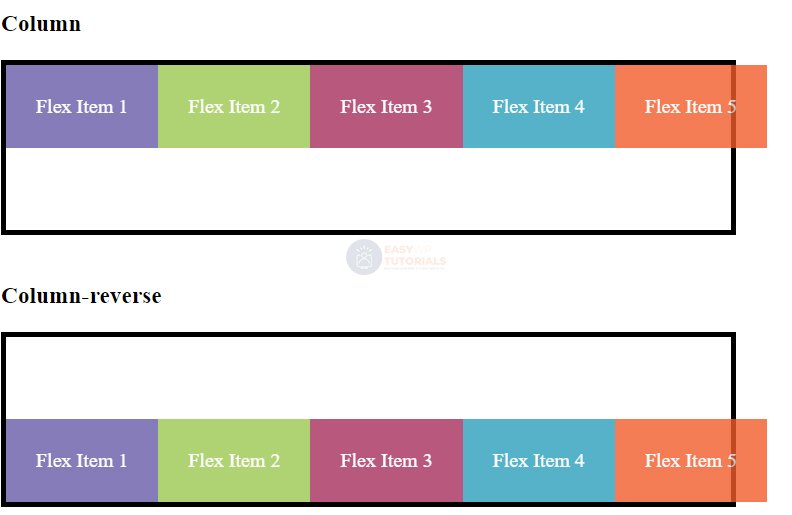
When laid out as a column, the container will create additional columns:
<!DOCTYPE html>
<html lang="en">

<head>
    <meta charset="UTF-8">
    <meta http-equiv="X-UA-Compatible" content="IE=edge">
    <meta name="viewport" content="width=device-width, initial-scale=1.0">
    <title>Flexbox In CSS3</title>
    <style>
        .flex-container {
            display: flex;
            border: solid 0.25em #000;
            width: 60%;
            height: 8.25em;
            flex-wrap: wrap;
        }

        .column {
            flex-direction: column;
        }

        .column-reverse {
            flex-direction: column-reverse;
        }

        .flex-item {
            text-align: center;
            font-size: 1em;
            padding: 1.5em;
            color: white;
            opacity: 0.8;
        }

        .color1 {
            background-color: #675BA7;
        }

        .color2 {
            background-color: #9BC850;
        }

        .color3 {
            background-color: #A62E5C;
        }

        .color4 {
            background-color: #2A9FBC;
        }

        .color5 {
            background-color: #F15B2A;
        }
    </style>
</head>

<body>
    <h3>Column</h3>
    <div class="flex-container column">
        <div class="flex-item color1">Flex Item 1</div>
        <div class="flex-item color2">Flex Item 2</div>
        <div class="flex-item color3">Flex Item 3</div>
        <div class="flex-item color4">Flex Item 4</div>
        <div class="flex-item color5">Flex Item 5</div>
    </div>

    <h3>Column-reverse</h3>
    <div class="flex-container column-reverse">
        <div class="flex-item color1">Flex Item 1</div>
        <div class="flex-item color2">Flex Item 2</div>
        <div class="flex-item color3">Flex Item 3</div>
        <div class="flex-item color4">Flex Item 4</div>
        <div class="flex-item color5">Flex Item 5</div>
    </div>
</body>

</html>