Sometimes we may encounter the fact that the space of flex containers is different in size from the space required for flex items. For example:
flex items don’t use the entire space of the flex container
flex items require more space than is available in the flex container. In this case, the elements go outside the container.
We can use the justify-content property to manage these situations . It aligns elements along the main axis (when arranged as a row horizontally, when arranged as a column vertically) and takes the following values:
- flex-start : The default value where the first element is aligned to the left of the container (when laid out as a row) or top (when laid out as a column), followed by the second element, and so on.
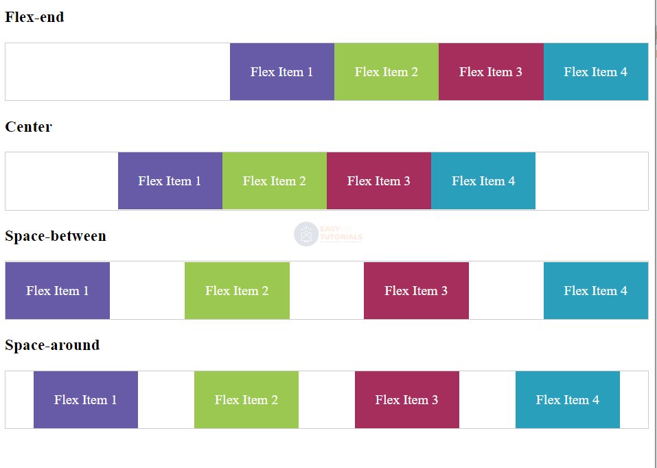
- flex-end : The last element is right-aligned (when laid out as a row) or bottom (when laid out as a column) of the container, followed by the penultimate element, and so on
- center : elements are center aligned
- space-between : if there is only one item in the stack, or if the items are outside the flex container, then this value is the same as flex-start. Otherwise, the first element is aligned to the left (when laid out as a row) or top (when laid out as a column), and the last element is aligned to the right edge of the container (when laid out as a row) or bottom (when laid out as a column). All the remaining space between them is equally distributed among the rest of the elements
- space-around : if there is only one element in the line, or if the elements go outside the container, then its effect is the same as the value of center. Otherwise, the elements distribute space equally between the left and right edges of the container, and the distance between the first and last element and the container’s borders is half the distance between the elements.
Alignment for arranging elements as a string:
<!DOCTYPE html>
<html lang="en">

<head>
    <meta charset="UTF-8">
    <meta http-equiv="X-UA-Compatible" content="IE=edge">
    <meta name="viewport" content="width=device-width, initial-scale=1.0">
    <title>Flexbox In CSS3</title>
    <style>
        .flex-container {
            display: flex;
            border: 1px #ccc solid;
        }

        .flex-end {
            justify-content: flex-end;
        }

        .center {
            justify-content: center;
        }

        .space-between {
            justify-content: space-between;
        }

        .space-around {
            justify-content: space-around;
        }

        .flex-item {
            text-align: center;
            font-size: 1em;
            padding: 1.5em;
            color: white;
        }

        .color1 {
            background-color: #675BA7;
        }

        .color2 {
            background-color: #9BC850;
        }

        .color3 {
            background-color: #A62E5C;
        }

        .color4 {
            background-color: #2A9FBC;
        }

        .color5 {
            background-color: #F15B2A;
        }
    </style>
</head>

<body>
    <h3>Flex-end</h3>
    <div class="flex-container flex-end">
        <div class="flex-item color1">Flex Item 1</div>
        <div class="flex-item color2">Flex Item 2</div>
        <div class="flex-item color3">Flex Item 3</div>
        <div class="flex-item color4">Flex Item 4</div>
    </div>
    <h3>Center</h3>
    <div class="flex-container center">
        <div class="flex-item color1">Flex Item 1</div>
        <div class="flex-item color2">Flex Item 2</div>
        <div class="flex-item color3">Flex Item 3</div>
        <div class="flex-item color4">Flex Item 4</div>
    </div>
    <h3>Space-between</h3>
    <div class="flex-container space-between">
        <div class="flex-item color1">Flex Item 1</div>
        <div class="flex-item color2">Flex Item 2</div>
        <div class="flex-item color3">Flex Item 3</div>
        <div class="flex-item color4">Flex Item 4</div>
    </div>
    <h3>Space-around</h3>
    <div class="flex-container space-around">
        <div class="flex-item color1">Flex Item 1</div>
        <div class="flex-item color2">Flex Item 2</div>
        <div class="flex-item color3">Flex Item 3</div>
        <div class="flex-item color4">Flex Item 4</div>
    </div>
</body>

</html>